Conversion rates determine whether or not a website can succeed. A high conversion rate means more sales and earnings, while a low conversion rate means the company will struggle to stay afloat.
Since maintaining healthy conversion rates is so important to running a successful online company, one of the most important factors influencing conversions is your site’s user experience.
Anything your leads, visitors, or customers encounter as they browse and interact with your site on each website or page feature is referred to as user experience (UX). It has to do with how quickly they can find what they’re looking for on your site—without being slowed down by needless pressure, which can cause them to abandon their quest and never return.
Here are some key ways your site’s UX can affect your conversion rates-
Video on Landing Pages

There is normally a lot of text to absorb as you visit a landing page. Since landing pages are just sales pages, they want you to click on the call-to-action button right on the page or click through to the main page to complete the transaction. If you have a very detailed value proposition to convey to guests, some landing pages can be very long.
In terms of user experience, this can be very difficult for people because—face lets it! Who has the time or desire to read so much text?
Situations like these are ideal for videography. According to studies, using videos on landing pages will significantly improve conversion rates. As conversions increase, it’s because the UX of a website has been enhanced. Conversions occur when a page effectively expresses its value proposition and inspires users or consumers to complete the page target in a seamless manner.
Consider TutorVista, a one-on-one, web-based tutoring program. Conversions increased by 86 percent when EyeView, a video-solutions provider, added a video to TutorVista’s landing page with the intention of increasing subscription signups.
Also Read: How to engage your website visitors with great UX design?
Call to Action Button Placement

The placement of your calls to action has a major impact on your customers’ UX. If the CTAs are difficult to see, read, or press, the UX and conversions will suffer. Many pages have the aim of selling something, whether it’s goods, subscriptions, or signups. CTAs, as well as their placement, are critical to conversions.
The fold is a UX term that refers to an imaginary line on a website that separates what users can see without scrolling down from what they can see only when they scroll down. Larger screen sizes—desktop versus tablet and mobile—allow for more information to be shown above the fold.
According to the NN Group’s UX experts, the average difference in how consumers handle content above and below the fold is 84 percent. To put it another way, content above the fold is seen 84% more than content below it. The thesis came to this conclusion after doing its own research and reviewing a Google study of display ads on various websites.
This already indicates that valuable material that you want your customers to see—like a call to action!—should be put above the fold. One company put this theory to the test and discovered that it was right.
Unbounce tested adding a secondary CTA above the fold to its PPC landing page, which originally had the CTA below the fold, directing leads to scroll down the page to the pricing grid, which was below the fold. This improvement in CTA placement resulted in a 41% increase in conversions.
The Speed of Your Website

Site speed is now, more than ever, one of the most important deciding factors in whether or not your UX is up to scratch. When compared to sites that are lightning fast, sites that are significantly slower experience conversion losses. (It might even have an effect on your organic search rankings.)
But how do you know when anything is quick enough?
According to a classic study conducted in 2009 by content delivery network providers Akamai and Forrester, 40% of users would leave a website if it takes more than three seconds for a page to make. If it takes three and a half or four seconds for your site to load, then poof. Your leads and conversions are both gone.
DoubleClick by Google conducted a much more recent analysis in 2016 that corroborated these earlier results. When it comes to phones, 53 percent of mobile site visits are abandoned if pages take longer than three seconds to load.
So you have three seconds or less to respond. That’s how quickly your site’s pages must make if you don’t want your visitors to think your site’s UX is bad because it’s slow!
Here are several useful site-speed tools to help you keep your site running smoothly:
- Google’s PageSpeed Insights
- Pingdom’s Website Speed Test
- GTmetrix’s Website Speed and Performance Optimization
Also Read: Top 9 UX Trends to Watch Out
Website Readability: Make it Bigger
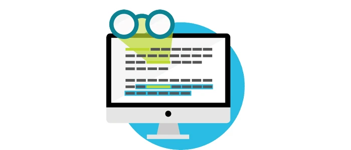
The readability of your website is an often overlooked feature of UX. It stands to reason that if your leads and tourists can’t make heads or tails of your site’s content, they won’t be able to figure out what they’re supposed to do. As a result, the user experience is abysmal.
They won’t know what to do if your copy isn’t readable.
Consider the fact that much of the copy on your site is ignored by your leads and guests. People usually skim site material, according to UX Myths. With such limited attention spans, it’s even more important that the material they do read is actually…easy to read.
This just makes the material more difficult to read. Content that is more difficult to read is often more difficult to comprehend. Your web conversions will suffer if your customers don’t understand what you want them to do on your site.
Since most people won’t read much of your material, you’ll need to make it even easier for them to absorb what they do read. Making fonts larger is often a good idea.
Free Shipping Works Wonders

Adding unique page elements to entice the shoppers to convert can often be all it takes to boost conversions. Consider this the extra nudge that shoppers need in order to convert in greater numbers.
As one retailer discovered, applying a free shipping threshold to an eCommerce platform can significantly increase conversions.
NuFace, an anti-aging device company, discovered that offering a small benefit during the checkout phase to consumers who were already familiar with their brand and goods improved conversion rates.
This case study illuminates other aspects of eCommerce UX psychology that contribute to understanding why free shipping is so appealing.
According to the 2016 Walker Sands Future of Retail Study, almost everyone who was polled said that free shipping is the most compelling reason for them to buy more online. If there was more free shipping, 90% of all respondents said they would purchase more from eCommerce.
What’s the takeaway? You offer free shipping to your customers when they ask for it, particularly when it increases the number of orders and the average order value!
Also Read: 16 Free Tools For Responsive Web Design Testing
Getting Rid of Friction in the Form of Navigation

The majority of web pages, and certainly all landing pages, have a single goal: to get tourists to convert. If a landing page has too much clutter in the form of navigational links that carry visitors away from the page, one of the main issues that can adversely affect conversion rates is when the page has too much clutter. These links serve as a diversion, working to undermine the page’s overall purpose.
AmeriFirst Home Mortgage’s case study exemplifies this concept perfectly.
AmeriFirst has a strategy of using bare landing pages, which are landing pages that don’t have any navigation. Visitors won’t be tempted to click away from the page’s only deal this way. Instead, they can concentrate on the bid, fill out the form, and complete the conversion without being distracted.
At AmeriFirst, this strategy of eliminating navigation from landing pages has resulted in a 30 to 40% rise in conversion rates.
It makes perfect sense from a user experience standpoint: when you delete distractions from a website, the users aren’t bombarded with competing choices. Their minds are at ease, allowing them to concentrate solely on the landing page’s single task—the page target.
Take Care of the UX, and More Conversions Will Follow

We used a variety of case studies to illustrate one of the most important digital marketing laws. When your site’s UX is flawless, you’ll see an increase in conversions. To put it another way, make sure your user experience is fantastic, and your guests will be much more likely to convert in large numbers.
Consider it from the perspective of your leads. If you land on a website, even if you’re interested in the deal you found through a Google Ads (AdWords) ad or an organic search result, but the offer is so unintelligible that you can’t understand any of it, your user experience would be bad. You’ll be distracted, and the ability to stay on the screen and work things out will be severely hampered. You’ll most definitely leave the page easily. You’re not going to change your mind.
As a result, if you ensure that a site’s UX is excellent through consistency and well-defined page objectives, you can expect higher conversions.








 in India